Build Your Own TACO
A new mnemonic for organizing information
I won't be so presumptuous as to say that this is information architecture without tears, for non-specialists, made-easy, and certainly not "for Dummies." (I've never liked that phrase, and don't think it's helpful.) This is more or less a simple model for myself to get closer to feeling comfortable with information architecture — an inroad to the discipline that doesn't pretend to say anything new. But I hope it says something useful in a memorable way, and helps someone else to start making progress on organizing information. It's helping me.
So without further ado, how to build your own T.A.C.O.
I'm currently tasked with working on wireframes for a student portal to replace an ancient system that was pieced together over many years, often with little to no user input. We've recently had a series of discussions with various stakeholders, and ended up with a sort of master list of things that matter to different groups and for different populations. Now the hard part begins: how do you organize that in a meaningful, usable way?
You may have heard of Richard Saul Wurman's LATCH mnemonic for organizing information, limiting available models to location, alphabet, time, categories, and hierarchy: L.A.T.C.H.
For my purposes, I've come up with just four things to focus on instead of five. I give you T.A.C.O.:
- theme
- audience
- convenience
- order
TACO addresses the four most important things about how your information relates to the people who access it:
- What's it about?
- Who's it for?
- What do they want to do?
- How can they make sense of it?
We start with the contours and end with the details, where LATCH treats them all sort of indiscriminately in an attempt to reduce anxiety, which kind of causes me some anxiety.
Theme
Theme is the broadest category and is highly contextual. It could be a department within an organization, a category used to group news items topically, an academic subject, or just about anything you can imagine as a unifying mental model. For this reason, it can have great overlap with other ways of organizing, and is best suited at the highest level.
Examples:
- category
- department
- question
- topic
Audience
Audience is often overlooked. How do you organize your information for an internal vs. an external audience, for beginners vs. experts, students vs. teachers? It can seem at times like a subset of either Theme or Convenience, but at its base, it may be the first consideration in organizing your information, sitting at the literal interface of your data and the people accessing it. It's up to you and your requirements whether it sits above topical organization or acts as a filter below, or is just a concomitant consideration.
Examples:
- administrator > editor > reader
- beginner > expert
- customer > supplier
- student > teacher
Convenience
Convenience is about ways of organizing based on utility, preferring usefulness within a given context. This encompasses things like relevance, interaction, and popularity. You may make the most relevant information available first or most prominently. You may emphasize content that a user can interact with or content that is dynamic over static content. This can be a kind of hierarchy, but that's too abstract. Like Audience, Convenience is focused on the user.
Examples:
- interactivity
- popularity
- relevance
- usefulness
Order
Order is probably, and likely counterintuitively, the last consideration for organizing information. It is certainly the last resort for locating information from the wide angle, e.g., a sitemap, but it's also likely the best way to organize things at the granular level. When a user has successfully located the most topical, personally relevant, and actionable information, you can focus on ordering in a logical or a generic way.
Examples:
- location
- name
- rank
- time
Your organization, your project, your content, and your time will have their own peculiarities and requirements, but in broad strokes, you're going to want to look at your data and determine (1) the big picture themes or topics, (2) who comprise the audiences, (3) how you can help them find what they're looking for, and (4) the best way of ordering things on the granular level.
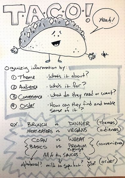
Here's the first thing I sketched out while thinking this through:

Let's stretch this thing as thin as possible, and divide tacos thematically with separate menus for brunch tacos and dinner tacos, then branch off by audiences, splitting meat tacos from vegetarian and vegan tacos. For convenience, we group all of the optional toppings, then maybe we order them into ranked groups (e.g., guacamole goes in the bonus "add for a $1" group), then internally order the toppings alphabetically. This is a kind of tree that should help anyone find the taco that's to their liking.
I might organize my information by degree programs, but build the menu by specific student populations, e.g., admitted students, then 1st, 2nd, and 3rd year students. I might privilege information they care most about, like class standing, course information, and exam schedules, or give time-sensitive things like deadlines and upcoming events a prominent place on the landing page. And then, of course, test and iterate.
And that's how you build a TACO. The ingredients will vary, but process is basically the same.
And if you want to really learn something, join me in reading Lisa Marie Martin's excellent Everyday Information Architecture from A Book Apart, which I was reading when this TACO thing took over my brain and made me stop to get it down on paper. I'm about ready to get back into the book, and I hope the next page doesn't explain why my dumb idea is so dumb.